What is Data Visualization?
It is a Graphical representation of Data. It helps us to understand outliers, trends, and patterns in data.
It is important to represent data graphically and make data-driven decisions.
Why we do Data Visualization?
Through Data Visualization we represent data in visual form, that grabs our interest and helps us analyze it easily. Our eyes are drawn to colors and patterns. We can easily differentiate colors.
It is storytelling with a purpose.
A good visualization tells a story, removing the noise from data and highlighting the useful.
We can see the difference if we stare at the massive spreadsheet on one side and charts, graphs, maps, etc on another side.
Type of Data Visualization
1.Charts&Graphs:
A chart is a graphical representation of data, in which "the data is represented by symbols, such as bars in a bar chart, lines in a line chart, or slices in a pie chart".
A Graph is a non-linear data structure consisting of nodes and edges. The nodes are sometimes also referred to as vertices and the edges are lines or arcs that connect any two nodes in the graph.
There are various types of charts and graphs :
1.Column Chart

2. Bar Graphs :

3.Line Graphs:

4.Pie Chart :

5. Scatter Plot:

6. Bubble Chart:

2. Tables:
The data table is an efficient format for comparative data analysis. The items being compared are placed in a column, while the categorical objects are in the rows. The quantitative value is then placed at the intersection of the row and column, called the cell.


2. Bar Graphs :

3.Line Graphs:

4.Pie Chart :

5. Scatter Plot:

6. Bubble Chart:

2. Tables:
The data table is an efficient format for comparative data analysis. The items being compared are placed in a column, while the categorical objects are in the rows. The quantitative value is then placed at the intersection of the row and column, called the cell.

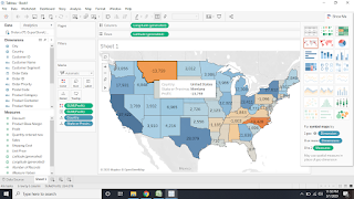
3. Maps :
Map visualization is used to analyze and display the geographically related data and present it in the form of maps.
There are many types in map visualization, such as administrative maps, heatmaps, statistical maps, trajectory maps, bubble maps, etc. And maps can be divided into 2D maps, 3D maps or static maps, dynamic maps, interactive maps.

4. Dashboards: A data dashboard is an information management tool that visually tracks, analyzes and Shows metrics and key data points to monitor the health of a business, department or specific process.


